first things first,
happy mother's day to all you mama's out there!
consider this my little gift to you...
i have created another picnik tutorial! the steps are quite similar to my last one... where you ended up with a soft and dreamy pearlie pink image... but this one has much bolder and brighter results and can be used on boys quite shamelessly too!
so if you want something that packs a little more punch, this tutorial is perfect for you.
and if you want something really soft and timeless and dreamy, skip on back to lesson one.
==============================================
1. open up picnik.com in your web browser
happy mother's day to all you mama's out there!
consider this my little gift to you...
i have created another picnik tutorial! the steps are quite similar to my last one... where you ended up with a soft and dreamy pearlie pink image... but this one has much bolder and brighter results and can be used on boys quite shamelessly too!
so if you want something that packs a little more punch, this tutorial is perfect for you.
and if you want something really soft and timeless and dreamy, skip on back to lesson one.
==============================================
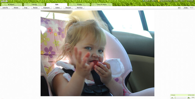
1. open up picnik.com in your web browser
2. under the home tab, click "upload" and choose one of your most favorite images for editing
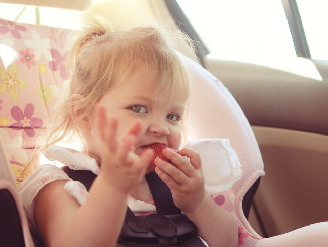
i probably could have chose a more interesting photo for this tutorial, but i just love this picture of cameron and it didn't make it on my strawberry pickin' post. i've also found that those everyday/mom-shots can transform into something canvas-worthy with just a little picnik lovin!
3. once your photo upload is complete, your picture will pop up under the "edit" tab. This is where the fun begins!
4. under the edit tab, click on the "exposure" option
5. bump your exposure up accordingly. bumping up your exposure reduces the contrast of the image, giving it a more soft and dreamy look. for this particular picture, since their was so much natural light coming in from the car windows, i only had to bump it up a bit. i bumped it up to 17, but use your best judgement.
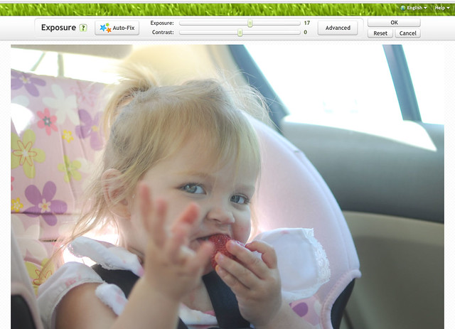
6. hit the okay button
7. now click on the create tab on the top navigation bar
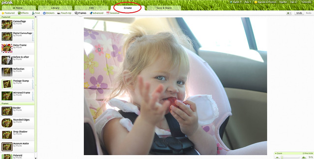
8. you will see a toolbar that has several options (featured, effects, tects, stickers, etc.). Click on the effects tab
9. scroll down to the "cross process" option and click on it.
this will turn your picture into a vintagey-yellow mess. this is called "over-processing" your image. NEVER accept the picnik settings as they are, LESS is MORE. you want your picture to look slightly-processed and more natural.
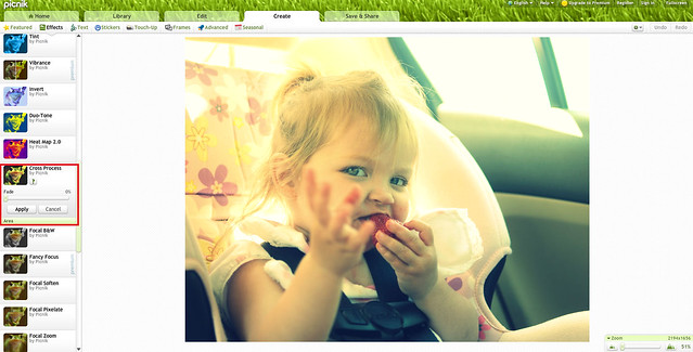
10. use the "fade" option to lessen the impact of this action. i set my fade to 60%. you still want a good amount of yellow to your image... the yellow gives it the vintage undertones we are going for.
11. hit the "apply" button
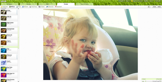
12. we're almost there! scroll back up and look for the "tint" option and click on it. your image will turn completely blue, but you are still on the right track :)
13. for the tint color choose the pinkish-red tint on the far left, bottom corner. this will change your tint from vibrant blues to vibrant reds, but the effect will still be much too strong.
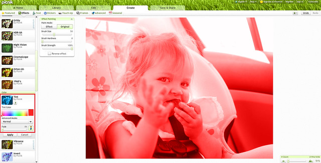
14. use the fade option to soften the reds. i've set my fade to 75 percent, giving the image a slightly pink tone to it.
you can set it to even less, so your image isn't quite as pink... it just depends on your preferences. the point is to balance out some of the yellows and blues in the image to give it a sweeter, pastel look.
you can set it to even less, so your image isn't quite as pink... it just depends on your preferences. the point is to balance out some of the yellows and blues in the image to give it a sweeter, pastel look.

15. hit the apply button and you are now left with a beautiful and perfectly processed image
16. click on the save & share option in the top navigation bar and explore your options from there. you can save to your computer, to facebook, to flickr, and numerous other places.
You went from this:
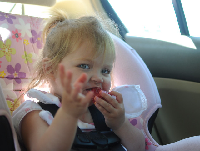
to this:
isn't it wonderful how a few simple steps can turn a regular image into something with a little more character? i didn't even use a fancy picture with a beautiful landscape this time.... yet somehow, the pink tones alone make me want to stare at it a little longer. but that's just me. and maybe you too? :)
if you try this little tutorial, i'd love for you to leave me a link or tag me in an image on facebook so i can what you've done.
if this post gets a lot of good feedback, there will be a lesson 3!
==============================================
i don't know how we'll celebrate this small victory, we are far too broke to go shopping haha...
but I believe God is pushing my heart in new directions and sewing is going to become a fine fine friend of mine.
I mean, just have a peep at my pinterest kid's clothing board.
sweetly dressed girls are one thing, but sweethearts in mama-made clothing are the icing on the cake
<3
i use picnik all the time. i've never played around with the tint before though, i'll have to try it out! thanks!
ReplyDeleteThank you so much for this. I have been contemplating sending you a email asking what you do your photos, they are always so gorgeous, and now I don't need to!
ReplyDeleteI have never used picnik but I will give it a try.
thanks again for sharing.
Thank you so much for this Kim! I have seriously contemplated emailing you to ask how you get this beautiful look to your photos. (Wasn't sure if you would want to give away your secrets ha!) I can not wait to try this out!
ReplyDeletethanks for this post! it's nice to know that beautiful pictures are attainable without having to buy 2000 dollar cameras and 3000 dollar lenses!
ReplyDeleteTried it out! http://elsteinmann.blogspot.com/2011/05/playground.html
ReplyDeleteWhat a great idea doing photo processing tutorials! Thanks for this, might have to check out picnik and give it a go. Nice to have found your blog! :)
ReplyDelete